UI Projects

The solutions

Esper menu redesign
The original Esper menu felt like a dense wall of information—visually cluttered and hard to navigate. I redesigned it to reduce cognitive load, enhance readability, and highlight key information using clearer hierarchy and spacing. The redesign preserves the spirit of the original while applying modern UI principles and accessibility considerations.

Drag the slider to see the before and after
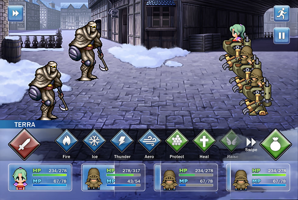
Battle UI redesign
The original interface was cluttered and hard to navigate, with inconsistent layouts and a bulky vertical turn-order bar. I streamlined the design by grouping related elements, refining HP/MP displays, and using consistent icons.
The character's stats bar fills over time from left to right to let you know when it's your turn. this saves a lot of space and maintains clarity without adding visual weight. The result is a cleaner, more intuitive UI.
(an extra character bar was added for reference since a normal party number in this game is four)

Drag the slider to see the before and after
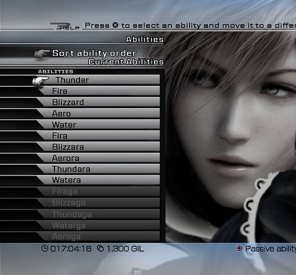
Abilities menu redesign
The original skills menu was bulky and visually disconnected from the rest of the UI. I redesigned it with large, easily tappable buttons for primary actions like Attack and Items, improving accessibility and flow during combat. Skills are now displayed in a compact, horizontally scrollable bar, allowing players to swipe through abilities without cluttering the screen. The layout feels cleaner, more intuitive, and better suited for mobile interaction.
Drag the slider to see the before and after
Modern Look, Same Soul
I gave the menus and buttons a clean new look still inspired by the original, but easier to use and more visually balanced. Clean shapes, consistent colors, and intuitive icons create a streamlined and cohesive system across all screens. The new style is consistent, intuitive, and designed with mobile interaction in mind bringing the classic UI into a modern format without losing its personality.

Final Fantasy 6 UI Re-imagined
Final Fantasy 6 UI Re-design
JUKAI: FOREST GUARDIAN
Jukai : Forest Guardian
I designed the in-game UI for the capstone game Jukai: Forest Guardian, an action-adventure inspired by Japanese mythology. Players control an elegant forest goddess who purifies corrupted spirits with the help of two mystical familiars.
The UI was designed to feel ethereal and light, using soft glows and elegant shapes to reflect the goddess’s nature and stand out against the dark forest setting. This contrast supports both visibility and the game’s central theme of light vs. corruption. Core elements like health, party, and quest info are grouped for quick access without disrupting immersion.

Final Fantasy 6 UI Re-imagined
Final Fantasy 6 UI Re-design
MOBILE UI MODULAR KIT
Mobile UI
Modular Kit
I created this modular UI kit for mobile games with a bright, playful aesthetic and touch-friendly components. The kit includes interchangeable buttons, sliders, rating systems, and containers designed for quick prototyping and consistent visual language across game screens. Each element was built with scalability and usability in mind, allowing developers to customize layouts without compromising visual cohesion.

UX Project
FINAL FANTASY 13
Combat user experience re-design
The Potential
I redesigned Final Fantasy XIII’s combat interface to address issues with its overly complex and fast-paced battle system. While the game aimed to blend strategy with action, its convoluted menu structure made it difficult for players to make quick decisions during combat. This led many to rely heavily on the "Auto-Battle" feature, reducing the experience to repetitive inputs.
I simplified the menu layout, made abilities easier to access, and improved controller inputs to help players stay engaged and in control during combat.

Complex navigation. Using an attack, ability, item or technique requires complex navigation that is too slow for the current speed of the Active Time Bar (ATB). The bar fills too quick for a user to navigate the menus looking for the next action they want to choose.

Disorganized and time-consuming menus. The ability menu can reach up to 16 different skills. When accessing the menu, the user can only see 8 on the screen and has to either scroll and move left, light, up or down to get to the right skill. This is too time consuming for the user, resulting in frustration and relying on auto-battle instead.

Discouraging the player from learning the combat properly. Putting Auto-battle at the very top of the menu as
a first choice encourages users to ignore going through the complex menus and rely on just clicking auto-battle over and over.
The challenges

Create a new in-combat ability menu. A new menu to displays every single skill in one long list.

Create a new menu to choose an ability. A new menu where the user can choose what abilities they want to activate or deactivate.

New ability to queue skills. the ability to queue abilities even if it exceeds their maximum ATB.
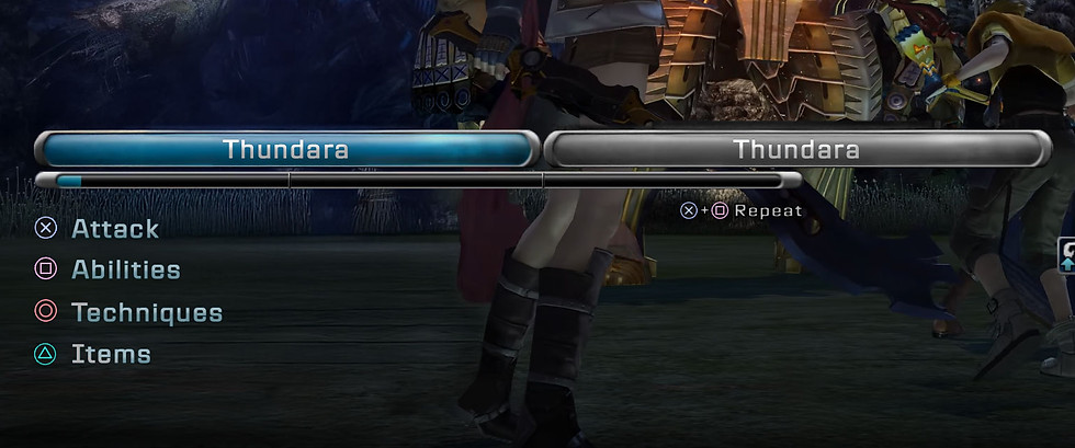
Introducing new in-combat ability menu

New in-combat ability menu.
A new menu has been added during combat that displays every single skill in one long list. The player no longer has to scroll down to find the skill they need, they are all visible immediately.
This list will also by default put all the skills that the enemy is weak to at the top of the list with the words “weak” so the player is aware it’s a weakness and can scroll through them quickly and effectively
Introducing choose ability menu
New choose ability menu
A new menu has also been added to the main menu where the user can choose what abilities they want to activate or deactivate. This menu is directly connected to the in-combat ability menu. The purpose of this menu is players can choose what abilities they want to activate or deactivate during battles.
Abilities can also be sorted to their liking, giving all players the ability to choose their gameplay experience the way that works best for them.
Introducing new ability to queue skills

New ability to queue skiils
Players can now queue abilities even if it exceeds their maximum ATB. Before, if an ability exceeded your ATB it could not be queued. This lead to players being frustrated because they could only use one ability at the time. This new system allows players to choose more than 1 ability at the time and give them time to make their next decision.
Repeat last combo button

A player can choose to repeat the last combo by pressing ">" + "square". This feature is available in the main game, however, the player isn't explicitly told
Adding the command subtly under the ATB bar, not only allows players to know but it also encourages them to try it.
Auto-battle button was moved

To discourage the player from only using auto, the auto button was moved to the bottom left of the screen. previously having the button at the very top of the menu made it the easiest and most prominent thing so players naturally decided to use it the most. now it still exists but players are more likely to try other options with the other buttons being more prominent.
New icons to show enemy weaknesses

Complex navigation. Using an attack, ability, item or technique requires complex navigation that is too slow for the current speed of the Active Time Bar (ATB). The bar fills too quick for a user to navigate the menus looking for the next action they want to choose.
Original skill menu
New skill menu

New look of the skills menu. The list has been replaced with just buttons, the player no longer needs to scroll down to choose an option
The reasoning is, instead of scrolling down to select your next move, the player can just press whatever button they want to to choose their desired command. this allows a more fast-flowing gameplay experience which is necessary with an active-turn based game since timing is very important.
Drag the slider to see the before and after
Conclusion
This redesign brings clarity and control back to Final Fantasy XIII’s combat experience. By simplifying menu structures and making inputs more intuitive, the interface empowers players to engage more actively with strategic decision-making instead of relying on automation. The result is a more rewarding, player-driven battle system that stays true to the game’s tactical ambition without sacrificing usability.
A side-by-side comparison in the final image highlights the transformation from a cluttered, fast-paced layout to a cleaner, more accessible interface that better supports real-time combat decisions.
Wireframe used to make the changes

Final Fantasy 6 UI Re-imagined
Final Fantasy 6 UI Re-design
Final Fantasy 6 Re-imagined